Getting Started
Choosing a paradigm
Before creating your first screen with owo-ui, you need to decide which approach you want to take: code-driven or data-driven. Here's a quick comparison:
| Code-driven | Data-driven |
|---|---|
| + Everything in one place: your logic and layout reside in a single file |
+ Superior, more readable visual structure |
| + Slightly faster to set up | + Can be changed by resource packs |
| - Hotswapping can be slow | + Instant reloading |
| - Slightly more hassle to maintain |
In general, the code-driven approach is recommended for beginners. However, it is often preferable to switch to data-driven UI design once you're more familiar with the framework.
While there is currently no tool for converting between the two paradigms, it's usually pretty easy to rewrite your UI in either of them - so don't worry too much about the decision you make here.
Code-driven
In order to begin building your first screen with the code-driven approach, create a screen class which extends BaseOwoScreen. You will notice that this superclass requires a type parameter - this is the type of root component you want to use. Since we're just starting out, let's pick the FlowLayout and implement the createAdapter() and build(...) methods.
public class MyFirstScreen extends BaseOwoScreen<FlowLayout> {

    @Override
    protected @NotNull OwoUIAdapter<FlowLayout> createAdapter() {
        // TODO
    }

    @Override
    protected void build(FlowLayout rootComponent) {
        // TODO
    }
}
You now need to fill in these two methods. In createAdapter() you have to initialize the UI system. For this job we use OwoUIAdapter.create(...) and pass in the screen and root component factory1, for which we'll choose the FlowLayout with the VERTICAL algorithm via Containers.verticalFlow(...), making the final implementation look like this:
@Override
protected @NotNull OwoUIAdapter<FlowLayout> createAdapter() {
    return OwoUIAdapter.create(this, Containers::verticalFlow);
}
About the UI Adapter
The UI Adapter is the primary entrypoint to using owo-ui. It handles input events, rendering the component tree, initiating layout inflation, and most importantly it implements all interfaces required to function as a vanilla widget. This means that adding owo-ui to an existing screen can easily be done by creating an adapter and addDrawableChilding it. This isn't a requirement however - the fact that you can use this one handle to utilize the entire UI system is the main reason it is as embeddable as it is. In general: If you have a 2D rendering context, you can use owo-ui.
And that's it! You now have the screen all initialized and ready to go. If you open it at this point, you'll see precisely nothing:
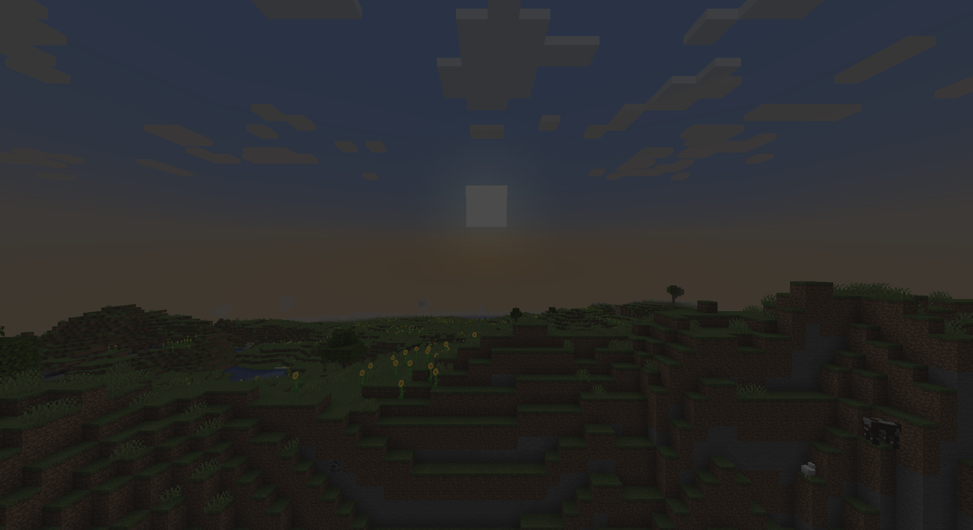
Let's fix that by giving our root component a so-called surface, in this case the standard dark, translucent background most vanilla UIs use.
@Override
protected void build(FlowLayout rootComponent) {
    rootComponent.surface(Surface.VANILLA_TRANSLUCENT);
}
About Surfaces
Every parent component (that is, every component which can contain other components) has what's called a "Surface" which is in charge of rendering the component's background. There are several defaults available to use directly on the Surface interface which should cover most bases, and all surfaces can be chained using the and(...) method. Should you require a more custom solution however, simply provide your surface as a lambda - it's only a rendering function after all.
Now the screen looks like this:
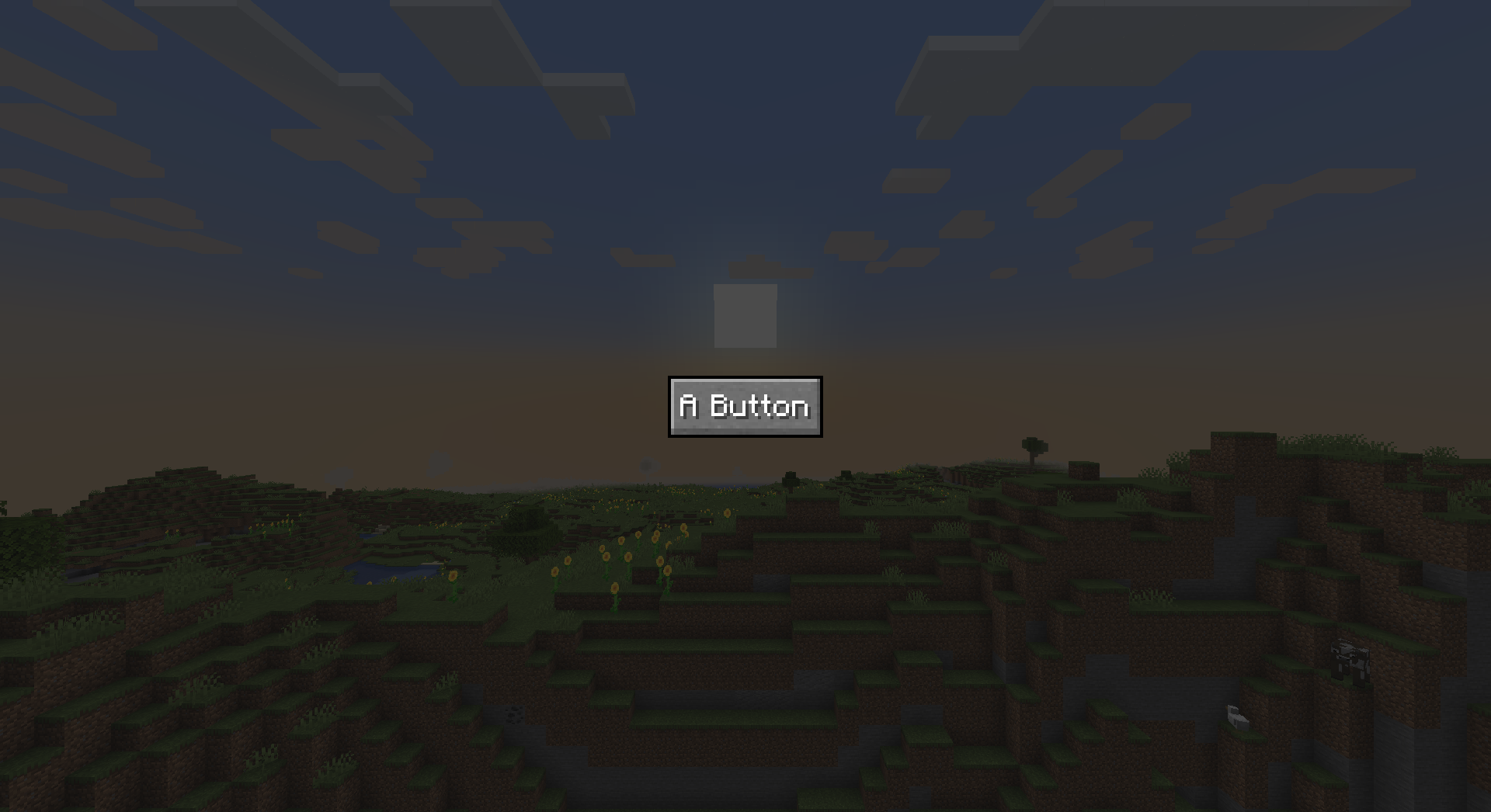
Great! Let's begin by simply adding a button right in the center. To accomplish this, we first set the root component's alignment to CENTER on both axes and then add our button - like this:
@Override
protected void build(FlowLayout rootComponent) {
    rootComponent
                .surface(Surface.VANILLA_TRANSLUCENT)
                .horizontalAlignment(HorizontalAlignment.CENTER)
                .verticalAlignment(VerticalAlignment.CENTER);

    rootComponent.child(
        Components.button(
                Text.literal("A Button"),
                button -> { System.out.println("click"); } // (1)
            )
    );
}
- Here we tell the button what do when pressed - in this case it just prints something to the console
Component type decay
While writing this code you probably noticed that all the methods we're calling on the root component return the component, so we can easily chain calls. You may even have tried to append the .child(...) call after the alignment has been set up, but couldn't because the method suddenly did not exist anymore. This is due to type decay - methods on components will always return the least specific type of component they're defined on. Because alignment is a property common to all parent components, the method returns precisely that - a ParentComponent instead of a FlowLayout, which does not define a way to add children. You will encounter this often, so remember that you can simply avoid it by changing the order of your method calls.
The result is as expected, a button saying "A Button" right in the center of our screen:
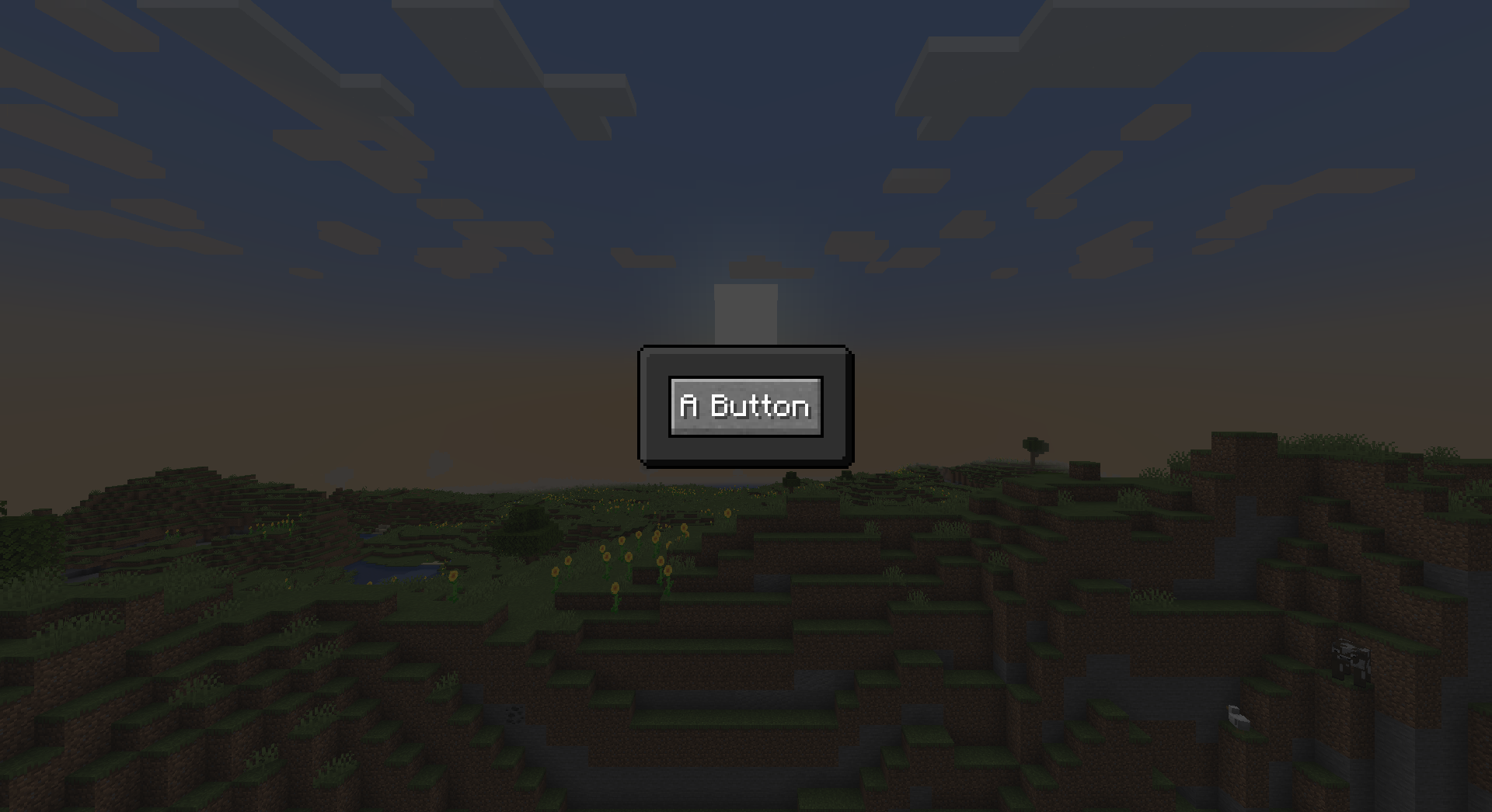
Before we finish off this introduction, let's wrap the button in a container and style that like a vanilla UI panel. To do this, we only need to create the container via Containers.verticalFlow(...) and add our button and surface to it like normal. If you understood everything so far, the following code should be pretty simple to grasp:
@Override
protected void build(FlowLayout rootComponent) {
    rootComponent
                .surface(Surface.VANILLA_TRANSLUCENT)
                .horizontalAlignment(HorizontalAlignment.CENTER)
                .verticalAlignment(VerticalAlignment.CENTER);

    rootComponent.child(
            Containers.verticalFlow(Sizing.content() /*(1)*/, Sizing.content())
                .child(Components.button(Text.literal("A Button"), button -> { System.out.println("click"); }))
                .padding(Insets.of(10)) // (2)
                .surface(Surface.DARK_PANEL)
                .verticalAlignment(VerticalAlignment.CENTER)
                .horizontalAlignment(HorizontalAlignment.CENTER)
    );
}
-
When creating the container we need to tell it how large it's supposed to be. By providing
Sizing.content()for both axes we tell it to make itself however large it needs to be to fit its children -
In order to properly see the surface of our container, we must make it slightly larger than the button - we do this by giving it 10 pixels of padding on all sides
Leaving us with a final screen that looks like this:
Data-driven
Before jumping in the XML-based approach, let's clear up some terminology. The XML file which we're about to make is called the UI Model, since it describes a UI. It contains your component tree and, optionally, templates which can be used for creating similar components with different parameters.
To create your first screen in this fashion, extend BaseUIModelScreen. Just like BaseOwoScreen it expects a type parameter describing which kind of root component you want to use. Since we're trying to create the same screen we did with the code-driven approach, we'll specify FlowLayout.
public class MyScreen extends BaseUIModelScreen<FlowLayout> {

    public MyScreen() {
        super(FlowLayout.class, /* TODO */);
    }

    @Override
    protected void build(FlowLayout rootComponent) {
        // TODO
    }
}
Now the superclass constructor requires a DataSource. This is simply a way to describe where the UI Model should be loaded from - for this there are two standard options:
-
DataSource.file(...)is used for development - you simply give it the file path to your UI model, relative to the game's run directory. With this data source, the file is re-loaded every time you open the screen, which enables the instant hotswapping. When building for production however, this is not an option and will crash at runtime.
As of 0.11, this is deprecated and should no longer be used. Instead, you can press Ctrl+F5 while viewing the screen and select your UI model file in the menu that shows. Alternatively, you can also use the/owo-ui-set-reload-pathcommand to associated a file with any given UI model -
DataSource.asset(...)loads the model from the current resourcepacks. It expects an identifier likemymod:my_ui_model, which would point toassets/mymod/owo_ui/my_ui_model.xml. This way the model is only refreshed when reloading resource packs, making for much better performance and allowing resourcepacks to override and customize your UI.
For this example, let's use the assets data source and place our my_ui_model.xml file in th assets/mymod/owo_ui/ directory of your project, turning the constructor into this:
public MyScreen() {
    super(FlowLayout.class, DataSource.asset(new Identifier("mymod", "my_ui_model")));
}
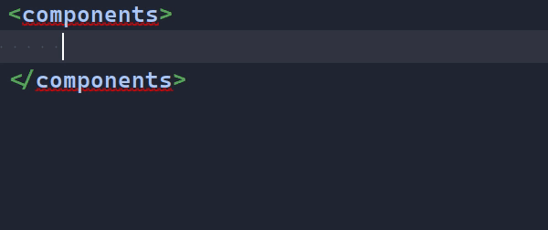
Now comes the meat of this exercise - creating the UI Model in XML. To begin, we'll create a file called my_ui_model.xml in the run directory, with the following content:
<owo-ui xmlns:xsi="http://www.w3.org/2001/XMLSchema-instance"
        xsi:noNamespaceSchemaLocation="https://raw.githubusercontent.com/wisp-forest/owo-lib/1.20/owo-ui.xsd">
    <components>

    </components>
</owo-ui>
If you're using IntelliJ, you now have to place your cursor on the URL in xsi:noNamespaceSchemaLocation, press Alt+Enter and select Fetch external resource. This will make it download the XML schema, giving you rich autocomplete and error checking right inside the IDE.
Great, you can now begin building your UI. Let's first declare the root component. We'll use the flow-layout, just as declared on our class, and say that its direction is vertical:
We're now again at the point were you can open your screen - once again it will just be completely blank. Let's add content then - for the sake of brevity this will now all be a single code block:
<owo-ui xmlns:xsi="http://www.w3.org/2001/XMLSchema-instance"
        xsi:noNamespaceSchemaLocation="https://raw.githubusercontent.com/wisp-forest/owo-lib/1.20/owo-ui.xsd">
    <components>
        <flow-layout direction="vertical">
            <children> <!--(1)-->
                <flow-layout direction="vertical"> <!--(2)-->
                    <children>
                        <button id="the-button"> <!--(3)-->
                            <text>A Button</text> <!--(6)-->
                        </button>
                    </children>

                    <horizontal-alignment>center</horizontal-alignment>
                    <vertical-alignment>center</vertical-alignment>

                    <!--(4)-->
                    <padding>
                        <all>10</all>
                    </padding>

                    <surface>
                        <panel dark="true"/>
                    </surface>
                </flow-layout>
            </children>

            <vertical-alignment>center</vertical-alignment>
            <horizontal-alignment>center</horizontal-alignment>

            <!--(5)-->
            <surface>
                <vanilla-translucent/>
            </surface>
        </flow-layout>
    </components>
</owo-ui>
-
This is where you declare the children of the flow layout - much like calling
.child(...)in the previous example -
Here, we declare the container for the button - this is the equivalent of
Containers.verticalFlow(...) -
Here goes the button itself. As you can see, we give it an ID - this will be important soon
-
We declare padding very similarly to how it's done it code - note however, that these declarations like
allcan chain. This means if you want 5 pixels on the bottom and 10 everywhere else, you could simply append<bottom>5</bottom>into thepaddingelement -
Surfaces work in much the same way as they do in code. The only difference is that they automatically chain - if you were to add
<panel/>before the<vanilla-translucent/>you'd get a vanilla panel under a dark rectangle -
This
<text>element denotes what the button says - you could also use a<text translatable="true">here and have it be translated instead
We really encourage you to write this yourself instead of simply copying it - the autocomplete in your IDE should make it a very fast process and will also make you discover many of the other components and options available. Once you're done with this, you can open the screen again and see that it looks exactly like the end result of the previous example! But wait, there's one thing missing - the button does not do anything when clicked.
Let's fix that by going back to our screen class' build(...) method. In here, you can query the button using the ID we just gave it. To do this, you call childById(...) on the root component. It is important to note here that IDs need not be unique within your hierarchy - this method simply returns the first matching component it comes across. For type safety reasons we also need to provide the type of component we're looking for, which, since we want the button, is ButtonComponent.class. After you have acquired the button this way, you can configure onPress like any other property:
@Override
protected void build(FlowLayout rootComponent) {
    rootComponent.childById(ButtonComponent.class, "the-button").onPress(button -> {
        System.out.println("click");
    });
}
After reloading your game, the button will work as expected.
What's next
Before jumping right in building UIs, we recommend checkout out the Component Basics and Layout Basics pages as they explain some more basic concepts you should be familiar with.
-
The root component factory is quite simply a function which accepts the horizontal and vertical sizing and returns a matching component - don't worry too much about this right now. ↩